Responsive Web Design in Artisteer
The widening range of devices with web browsing features has recently created quite a challenge for web designers who are expected to craft websites with optimal viewing experience across most gadgets. As a result, the last couple of years saw the emergence of several approaches to web design that have found their friends and foes. Among them are the two opposites.
Full Website with Mobile Version or Template
This approach favors creating separate desktop and mobile designs or even separate websites with cross-linking. The basic mobile version can be created first and then enhanced with features for the desktop use (mobile-first strategy) or the desktop version can be simplified for the mobile usage (graceful degradation strategy).
One of the key supporters of “the full website with mobile version” approach is Jacob Nielsen (see the article Mobile Site vs. Full Site ). Analyzing websites from the point of usability he concludes that: “a good mobile user experience requires a different design than what's needed to satisfy desktop users”. Optimizing a website for mobile use according to Jacob Nielsen would involve cutting features, cutting content, enlarging interface elements and publishing the changed version as a separate website with a cross-link to the full version. The third design should be created for 7 inch tablets like Amazon Kindle Fire.
However, not everybody would like to have some features and content cut from the website to make it fit the mobile screen and even more would not like to pay for two websites and a tablet design. Web designers also started to search for ways that could help optimize and simplify the development process. It was the dawn of Responsive Web Design. Nevertheless, the mobile first strategy is still used partially because about 20 % of mobile browsers (mostly the old ones) like Samsung Bada, Blackberry Bold and Windows Mobile do not support media queries. The support for media queries across all major browsers (according to caniuse.com) is currently at 80.98%.
Responsive Web Design
Responsive Web Design is the opposite approach as it involves creating a single design that will adapt to the device. The term was coined in 2010 by Ethan Marcotte in A List Apart Magazine. RWD uses a set of standards-based technologies like fluid grids, flexible images, and CSS media queries which are supported by Android, Opera Mini and iOS mobile browsers. These technologies make the design more flexible and provide device awareness. In other words RWD makes the website adapt to the particular screen resolution by positioning the page, scaling the images, changing its layout for comfortable scrolling and panning (you can refer to Responsive Web Design: What It Is and How To Use It for more information). The RWD approach requires a special type of thinking from a web designer, and it can be implemented differently, but you can check how responsive a website is by resizing the browser window with additional tools that shrink or expand a browser window to a specific size, e.g 480 x 800.
Does Artisteer support Responsive Web Design?
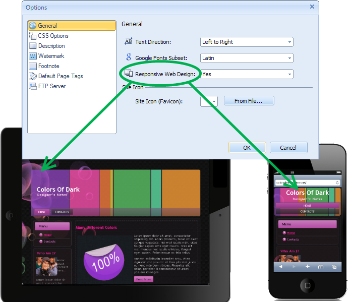
Artisteer 4 has become the first web template generator with responsive templates. The 4.0 version includes the option Responsive Web Design (Export → Options → General) that allows to enable/disable RWD.
Responsive templates in Artisteer are designed for the optimal viewing experience on desktops, tablets (Landscape and Portrait orientation) and smartphones (Landscape and Portrait orientation). It was not designed for specific devices and requires that the browser (Firefox, Chrome, Opera, Safari etc.) of the device supports HTML5+CCS3.
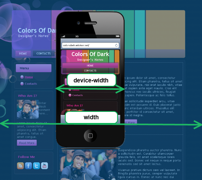
The responsive design becomes active when a website does not fit the browser window of the device, in other words, when the browser window size is smaller than the width of the website. The default (desktop) layout appears if a website width is the same or less than the browser window size. It means that the desktop layout may appear on the tablet in Landscape orientation, but changing orientation to Portrait will activate the responsive style rules for tablets. If you are using the Fluid Sheet layout, the starting point for responsive styles is 768px.
When the Responsive Web Design option is enabled two extra files (responsive.style.css andresponsive.script.js) are added to the template folder. So, exported templates with enabled responsive design include two additional files apart from the usual style.css file. The *.responsive.* files do not affect the main style.css and script.js files, so it easy to find and edit the responsive design.
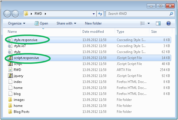
The following code is also added to the Head section of HTML pages to load the style.responsive.css file.
<link rel="stylesheet" href="style.responsive.css" media="all" />
<script src="script.responsive.js"></script>
What Technologies Does Artisteer Use for Responsive Design?
Artisteer uses the .responsive, .responsive-tablet, and .responsive-phone CSS classes, and a number of standards-based RWD technologies. These are:
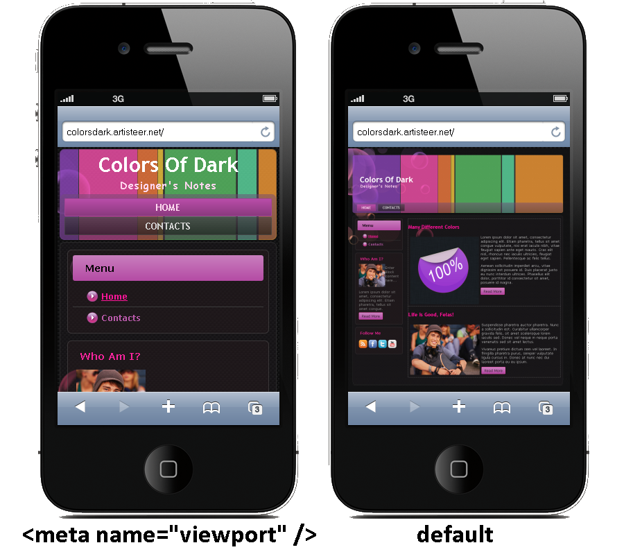
- Meta Viewport Tag
- Media Queries
- JavaScript
- Flexible grids
- Flexible images
The Viewport Meta tag is used for website scaling. Without the Viewport Meta tag, the website will be rendered for larger screen resolution and downscaled. The Viewport Meta tag is generated only when the Responsive Web Design option is enabled in Artisteer Export Options (Export → Options → General).
The CSS Media Queries are used to define styles for different screen resolutions.
JavaScript code is used to add the specific CSS classes to HTML tags that help to define the device in the .css file and create the appropriate style rules for certain devices. These are .responsive, .responsive-tablet, and .responsive-phone CSS classes.
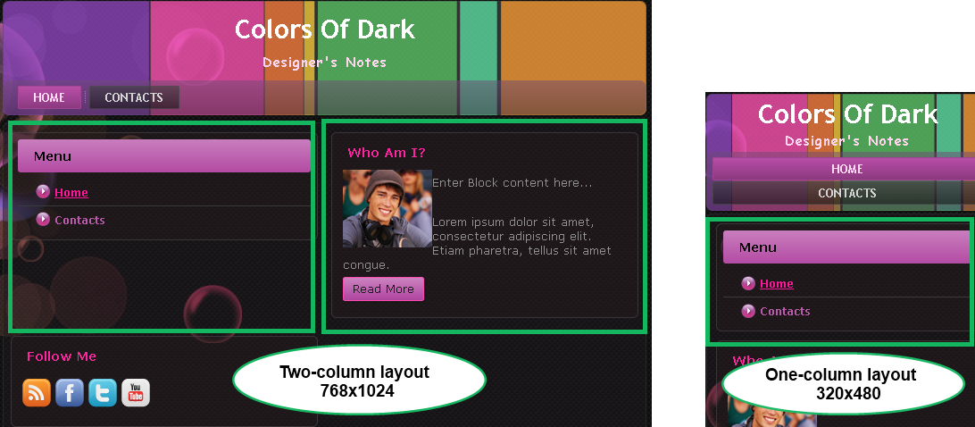
The flexible grid is used to make the layout adapt to the screen size. The width becomes relative and changes proportionally to the screen width. The blocks and cells in the layout for tablets re-arrange and build two columns. In the layout for smartphones they follow each other in a single column.
Both fixed and fluid sheets on mobile devices with small screen resolutions become flexible and the sheet width will be equal to that of the screen.
Content images in Artisteer templates are styled with the “max-width: 100%;” CSS property. It means that if an image becomes larger than a content cell it is reduced to fit the cell.
What about Navigation?
The responsive styles in Artisteer templates are applied to the horizontal menu if the screen width is 480 px or less. The display of submenu items can be configured using the Levels option (Menu → Submenu → Options → Responsive Levels):
- “One Level” implies that subitems are not shown in the horizontal menu.
- “All Open”. The subitems are displayed under the menu items.
- “Expand with reload” suggests that clicking a parent item opens up a list with subitems and loads the parent item page.
The Vertical Menu does not change in responsive design.
The Header
The Header in the responsive web design mode changes its layout: the Headline, Slogan texts and Search widget become centered while the foreground images, slideshow and flash animations are disabled.
Is the responsive design in Artisteer compatible with third-party widgets and solutions?
If a widget supports responsive design it should be compatible with Artisteer templates. The widget may not fit the screen if it has a fixed size.
How can I add custom CSS for Responsive design?
To add custom CSS, navigate Home → Export → Options → CSS Options and add the code in the field Additional CSS Styles.
To add a responsive style, use the following selectors:
.responsive [selector] {
/* for styles that apply to all devices */
}
.responsive-tablet [selector] {
/* these styles are applied to tablets */
}
.responsive-phone [selector] {
/* the styles for smartphones */
}
Example.
To increase the margin between the cells in responsive design for tablets, you can add the following code:
.responsive-tablet .art-post .art-layout-cell {
    margin: 2%;
    width: 46% !important;
}