Choosing Fonts in Artisteer
With Artisteer 4.0, there are four types of fonts you can select from.
System Fonts
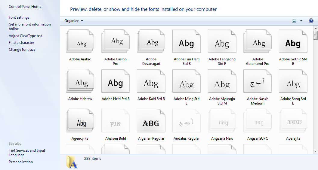
The System fonts are any fonts you have installed on your Windows or Macintosh computer. On Windows, if you go into your control panel, you’ll find a list of these fonts.
Windows 7:
Web Safe Fonts
In Artisteer you can select a font from any of the System fonts installed on your computer.
When viewers request one of your pages, the browser show the text using the font that defined in your page.
However, when your website visitors don't have the same font(s) installed, they
may see a different font instead, depending on fonts installed in their system.
To avoid this problem most websites use fonts called Web Safe Fonts, which
are common on most Windows, Macintosh and Linux computers. Web Safe Fonts
simply refers to a list of certain system fonts that are commonly installed. If you want your web pages to
present the same look to all visitors you should use one of these fonts (or use a Google Web Font as described below).
The Web Safe Fonts are readily accessible since they’re usually the first set of fonts you can select from.

Google Web Fonts
Starting with version 4.0, Artisteer now supports Google Web Fonts. These are hundreds of open source fonts designed specifically for the web. Like images, links to the fonts can be embedded in a web page and the browser will
load the font from the web when the page is displayed. Unlike system fonts, you can choose from hundreds of fonts when you design your pages without worrying if your viewers have those fonts installed
on their computers. Of course, like images, or anything else you embed from
other sources, this adds a certain amount of overhead to loading your web page.
You select a Google Web Font using the ‘Font Options’ dialog (from any of the ‘Font Options…’ selections). The font list in Artisteer can be difficult to follow since the dialog can only display a small set of fonts.

Here are some tips to make it easier to work with fonts.
- The Web Safe Fonts are always listed first. There are only a few of these so they’re not difficult to scroll thru. The Google web fonts and System fonts come after the Web Safe Fonts. Within each set, the fonts are listed in alphabetical order.
- Every font has a unique name. If you know the name of the font you’ll find it easier to enter the name versus selecting from the list. But remember you have to enter the name using the correct spelling and character case (e.g. ‘tinos’ is incorrect, but ‘Tinos’ is correct). If you entered the name correctly the font list should change and the font you want should be highlighted, otherwise you need to try again.
- When choosing a font, you’ll probably find it easier to use something else to preview what the font looks like.
We already mentioned before that Windows and Mac platforms come with tools to view the
system fonts on your computer.
For Google Web Fonts, use the official web site to select your font, and then enter the name of the font in Artisteer; use copy&paste off the web page to avoid typos in the name.

Using Google Web Fonts Subsets
Artisteer also supports font subsets. This is useful if your content includes text in non-Latin character sets such as Cyrillic.
What is a ‘subset’? A font describes what characters are supposed to look like. For instance, the web font ‘Arial’ describes how the Latin letter ‘A’. The design for the letter ‘A’ is the typeface. The design can be anything but typically all font typefaces are similar. That is, the letter ‘A’ is still recognizable as the letter ‘A’. In other languages however, the alphabet is often quite different and the way each character looks also has a completely different form (e.g. Cyrillic alphabet).
Most of the Google web fonts are designed for Latin character sets which includes most of the languages of Western Europe and the Americas. There are many other character sets though, like Cyrillic, which are quite different from the Latin form. When you’re working with these character sets you need a font that includes special typefaces for these characters. Most Google fonts are designed to handle Latin characters; there are some fonts that will handle other character sets. If you’re working with one of these fonts, you select a ‘subset’ which defines which type of character set you want to use.
Artisteer supports Google ‘subsets’. In your Export options, you select which subset you want:

If you later select a Google font that also supports a subset, when you export your template, Artisteer will automatically add the necessary code to your web pages to add the font and the subset.
Let’s look at an example using Cyrillic characters:
First, you have to find a Google web font that supports Cyrillic characters.
Under the ‘script’ list on the search page (http://www.google.com/webfonts), select ‘Cyrillic.

The page will display all of the fonts that have support for Cyrillic characters. We’ll use the ‘Lobster’ font.
Create a new blank project in Artisteer, and then in your Export options (Home → Export Options), select Cyrillic for ‘Google Fonts Subset’.
Under the sample text generated by Artisteer add some Cyrillic text. We used Google translate and copy&paste, but of course if your computer is configured to handle Cyrillic, you can do this directly.
Under the Content tab, select the Text icon and then ‘Font Options’. Enter ‘Lobster’ for the font family.
Your page should look something like this:

You may notice right away that the font changed for the sample text but the Cyrillic text we added hasn’t changed. Why? First, the font we selected also supports the Latin character set so any Latin characters in our page changes automatically. Second, ‘subsets’ only apply after you export your template. You won’t be able to preview your design until you export and view your web page. You can change some attributes like the font size, but you won’t see the text in the new typeface until you view your exported template. That is, you won’t see the Cyrillic text in the ‘Lobster’ font until you preview your pages or you export your template.
You may also notice that the other text on the page doesn’t change (i.e. second Row). This is because we only changed the Paragraph text. The other text that appears below the first Content Cell is part of a List, and a Quote which are different elements. If you want this text to have the same font, you need to change the font for each of these elements (Content → Quote → Font Options, and Content → List → Font Options).
When you preview this in a browser (File → Preview in Browser), now you’ll see that the font is applied to the Cyrillic text.

Note, with Google Web Fonts, you can select one subset or several subsets. In Artisteer you can only select one subset in your Export options, but Artisteer always includes Latin along with your selection.
family=Lobster&subset=latin,cyrillic
Theme Fonts
Theme fonts are not really fonts but since they appear in the font list when you’re creating your template, they deserve explanation.
In Artisteer, you use the Content tab to create a style for your web pages. Under the ‘Style and Font’ section of the ribbon bar, you select how you want Headings and Text to appear on your pages.

Instead of selecting a particular font for each, you can apply a Font Set using the Colors & Fonts tab.

In the picture above, the Font Set selection is ‘Classic’. ‘Verdana’ is the font applied to all Headings. ‘Tahoma’ is the font applied to Text in your web page.
Later if you want to refine the font selection you can select from the Theme font. For example, suppose later you want to make your Lists or Quotes to appear in the same font used for Headings.

Under Theme Fonts, Artisteer lists the fonts that make up the current Font Set selected. ‘Verdana (Headings)’ is the font applied to Headings. ‘Tahoma (Content)’ is the font applied to Text. If you change Text to ‘Verdana (Headings)’, now all the text has the same font as the Headings. It’s a shortcut to adjusting your fonts.