Template Deconstruction: Markour Law (Part One)
Have you ever wanted to add an image to your content but you also wanted to put text, buttons, links, etc., over the picture? The Markour Law template has this kind of feature done with custom code.
We’ll explain how and then we’ll modify the sample and show you how to achieve a similar effect but without writing any code. We’ll also show you how to add some cool styling with custom CSS declarations.
Next time we’ll show you how all of the Layout elements, like the Content Area, Sidebar and Vertical Menu were aligned to fit together as they do.
If you would like to follow along you can download the markour law .artx project file here .
Note though, this article is based on deconstructing the ‘Website or Blog’ version of the template. If you’re following along, please change the template type after opening the Artisteer project (File?Change Template?Website or Blog).
Also, this article was written based on the Standard Edition of Artisteer, version 3.1.0.48375. If you’re using a different version, or edition, the features, menus, and dialogs may not be available.
To recreate one of the sample templates from a new project can often take more than fifty different settings.
This can be very tedious to follow if we went step by step, so in this article we’ll concentrate on just a few settings as if we were reconstructing part of the template.
We’ll explain how the basic layout of the Page was created, and how the designer added certain parts but we won’t go thru everything.
In the next newsletter we’ll actually deconstruct the article to a certain point and then go thru each of the settings necessary to get back to the original template so you can see how to use margins and paddings to get the same layout in the template.
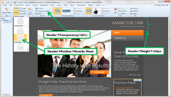
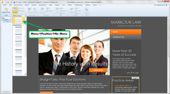
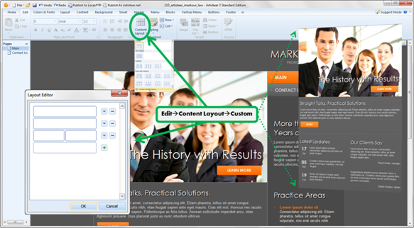
So, the basic settings for this layout are the following: the transparent Header outside Sheet, no Horizontal Menu, the Sheet with two columns and the Content with custom rows and cells.
Configure the Header
Configure the Menu
Create Custom Content Layout
Now here is one way to add text and a button over the picture.
Add the Picture
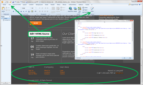
Add Some Text and a Button on Top of the Picture
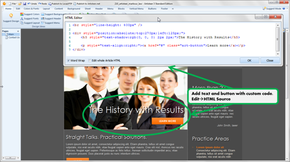
If you try this, make sure that you select the correct Cell with the cursor first before opening the HTML editor (i.e. the Cell with the image).
If you’re not familiar with CSS, this is a brief explanation of the code:
This template uses a custom content layout. A Custom Layout in Artisteer consists of Rows, and Rows consist of Cells (columns). A Cell, or Row, in Artisteer has a certain width which depends on the Sheet width and the number of cells (columns). You can adjust the Cell widths but the total width of the Row can’t exceed the width of the Sheet. The length (i.e. Height) however is variable and depends on how much content (e.g. images, text, etc.) you add to the Cell.
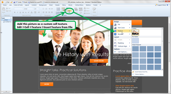
When you add an image as a Texture, Artisteer displays only as much of the Texture image as the size of the Cell, so if you have no content, then the texture is truncated until you add something.
The first line of the custom code adds a line break, but also sets line size for this Cell to 400px. This ensures that the Cell, and the displayed background is 400px long.
<br style ="line height: 400px"/>
For example, if we change this line to a simple line break (i.e. <br/;>), then the Cell and image look like this:
Why? Because now the Cell defaults to 1 blank line, the size of which depends on the default Text attributes (Content>Text).
If you keep adding line breaks (with the keyboard Return/Enter key), you’ll see that as you add more blank lines to the Cell, more parts of the underlying Texture image are displayed.

So the original custom code
<br style ="line height: 400px"/;>
, is like inserting one big blank line.
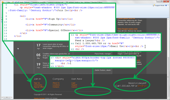
The second part of the code adds some Text and a Button, but so they both overlap the picture:
<br style ="line height: 400px"/>

<div style="position:absolute;top:270px;left:125px;">

   <h5 style="text-shadow:rgb(0, 0, 0) 2px 2px;">The History with
Results</h5>

   <p style="text-align:right;"><span class="art-button-wrapper">
      <a href = "#" class ="art-button">Learn more</a>
   </p>
</div>
This code creates a Layout that is positioned at a specific offset from the top of the Cell (270x125).
Within this layout we have some Text in H5 style, and a Button below (‘#’ is a redirect to the current page. You can replace this with an URL to redirect users elsewhere).
Add a Custom CSS Style
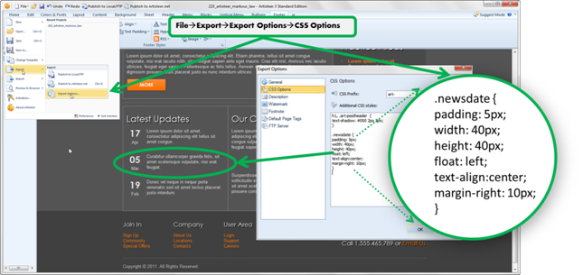
The newsletter format was created with custom code and a custom CSS style.
Tailor Existing CSS Style
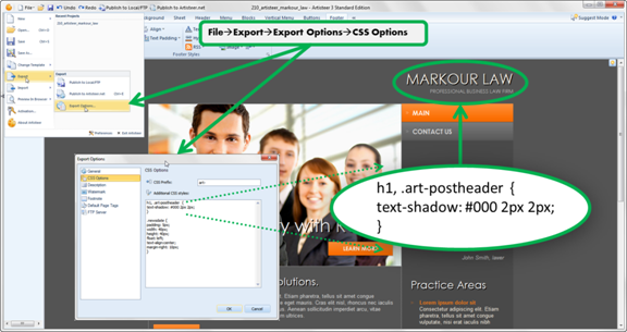
The ‘shadow’ effect in the Headline and other parts of the Page were also formatted with a custom CSS style.
This declaration creates an additional style rule for ‘H1 Headings’, and post article headings (which don’t exist in this template). There’s already a style for H1 elements in Artisteer. This code adds an additional style rule for H1 to create a ‘shadow’ effect.
If you understand CSS and HTML, you’ll notice that this template has several H1 Headings, including the Headline (Slogan is H2). However, the CSS rules as created by Artisteer depend on where the H1 appears in the page (e.g. Header, Content, etc.). Right now, this rule applies to all H1 elements, but if you only want the shadow on the Headline, then you could redefine just the ‘art-logo-name a’ CSS rule.
Create Footer with Custom Code
Create Footer with Custom Code (cont.)
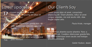
Insert Another Image in the Content
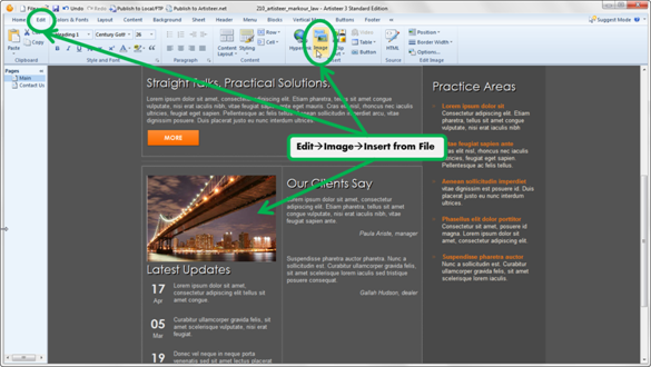
The text and button over the picture in the first Cell (see above) was added with custom code but there’s another way you can do this with your content layout to get a similar effect.
In the illustration above, we’ve modified the original template to add another image to the content. Note how the text in the column shifted down below the image.
Insert the Image as a Custom Cell Texture
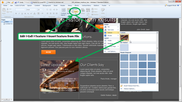
Now the image appears in the background of the cell with the text in the foreground. If you don’t need precise positioning of your text, buttons, links, etc. relative to the image, you don’t need to write any custom code to get this effect.
Insert the Image as a Custom Row Texture
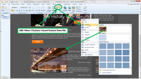
Now the image overlaps the background of the Cell to the right.
Row vs Cell

Notice now if we add the image to the Row, the image overlaps the next Cell in the Row, but when added to the Cell, the image is cropped to the width of the Cell.
Also, for both Row and Cell, the image doesn’t extend all the way to the bottom of the cell (row).
The height of the Cell depends on how much content has been added to all the cells of the row. The Texture is just the background of the Cell. Unlike an image you might insert in the content area, you can’t resize the Texture image to fit the Cell. You can scale the image with the Texture Position options but it’s always based on the original display dimensions:
Scale Texture Image
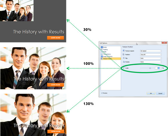
The image is cropped to fit the original ‘width by height’ display area (i.e. original dimensions of the image).
So, if you’re creating your own Texture image, you should consider creating an image that is slightly larger than the background of the Row (or Cell), after you’ve added all of the content to your page since the content determines the length (i.e. height) of the Row and Cell.