Responsive Header
Starting from the version 4.2 Artisteer provides options for customizing Header for all kind of responsive views.
There are 3 different situations where you may want to use those options:
-
Your Header contains a background image which doesn't become responsive.
This issue is related to the fact that sometimes background image can't be stretched proportionally according to your screen size. That means that your header may have an unpleasant look on your website.
-
The position of Header elements doesn't work for all responsive views – on smaller screens elements can overlap each other and you may want to reposition them for different kind of screens.
-
The size of Header elements doesn't fit all screens and you may want to customize the size of each Header element.
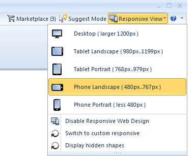
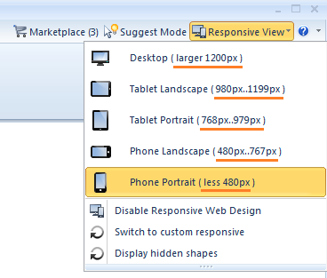
Artisteer generates responsive Header automatically - it uses certain algorithms to place header objects in the most logical and correct way. To see how your Header will look like in the
Default responsive mode, you need to switch to one of the responsive views by going to the top right corner of Artisteer and navigating to one of the views:
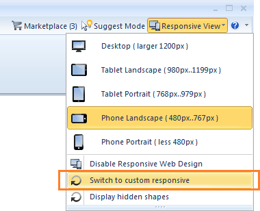
However, if you want to customize Header, there is the
Custom responsive mode that allows dragging objects, resizing them and adding new ones:
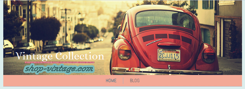
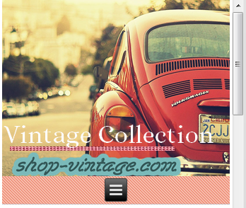
Let's review both of the modes in the "Phone Portrait" view using the following example of Header that consists of a Header background image – the car on the street, an Imagelink - the "shop-vintage.com" clickable logo, Headline - the "Vintage Collection" line and a simple image - a pink line-divider:
 Default Responsive mode
In this mode, Artisteer shows you how your Header will look like by default, if you simply export your project right now:
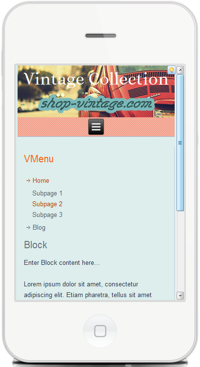 Please note, that unlike imagelinks, simple images or shapes do not appear in this mode.
In this view you can play with background image options to find the best position for your Header background image:
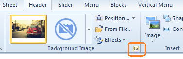
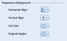
You can change horizontal or vertical alignment of the image, choose whether to use original Height or no, and change
CSS Size property.
Please note that the changes will not be visible within Artisteer. You will see them when previewing your template in a browser or after opening the exported project on your mobile device.
This issue is related to the fact that Artisteer doesn't operate with HTML code within Artisteer preview area when working with a responsive Header.
Custom Responsive mode
Once you switch to this mode, you will notice that the height of your Header will be changed – now it's the same as the height of Header in the Desktop view, and all simple images (pink line in our case) will appear:
Let's imagine we want to create a new background image, because the current one doesn't fit the screen as we want to. Artisteer provides approximate width values that are used for each responsive view:
Taking into account this information, we will need to create a Header background image (or images) that would fit screens with such values.
To insert your new image, please go to
Header tab >>
Image >>
From File.
You can change the size of the inserted image using the arrows provided for it.
Once the image is inserted, you need to change its “Visibility”, so it was visible only in the "Phone Portrait" view. Right click on the image and choose “Visible”, unclick the Desktop view:
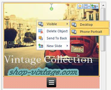
In general, "Visibility" settings are available for each Header element in the Custom responsive mode.
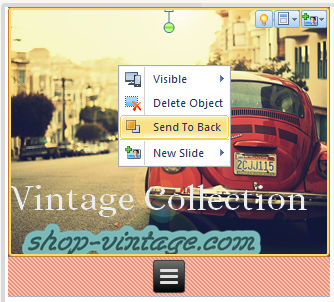
You may also need to use the option “Send to Back”, so you can see other images, beyond this new image:
 Sometimes it's also easier to switch between Desktop and Responsive views to operate with elements, so you may need to edit "Visibility" settings in the last turn.
Since you're using a new background image now, you don't need your default background image in this responsive view.
To get rid of it, go to
File >>
Export >>
Options >>
CSS Options and insert this code:
@media (max-width: 479px)
{
    .art-header { background: transparent !important; }
}
This code means that once your screen width becomes less than 479px, which is a condition to switch to the Phone Portrait view, the Header background image will disappear.
Here is the code for the Phone Landscape view:
@media (min-width: 480px) and (max-width: 767px)
{
    .art-header { background: transparent !important; }
}
Tablet Portrait view:
@media (min-width: 768px) and (max-width: 979px)
{
   .art-header { background: transparent !important; }
}
Tablet Landscape view:
@media (min-width: 980px) and (max-width: 1199px)
{
    .art-header { background: transparent !important; }
}
You shouldn't insert all the code at once, because you may be satisfied with a Header background image position in a Tablet view and you won't need to use a custom background image for all responsive views.
Please note that the default background image won't disappear from the responsive views in Artisteer. You will see it only after previewing your template in a browser or after opening the exported project on a mobile device. This issue is also related to the fact that Artisteer doesn't operate with HTML code within Header. All elements in Header within Artisteer preview area are objects, they transform into an HTML code only after exporting.
You may want to change the size of the imagelink like "shop-vintage.com" for each responsive view - for this you will need to reinsert the Imagelink (
Header tab >>
Controls >>
Imagelink) and repeat the operations with its resizing and Visibility settings.
If you only change the position of the Header element, you don’t need to reinsert it for each view. Use one image/element for all views. The position will be saved individually for every view. However, if you also want to change the size of the element/image, you will need to use separate elements/images for a Desktop and Responsive view.
So, after all customization which included new background image and repositioning the objects, here is how our Header looks like in the “Phone Portrait” view:

You may want to reinsert background image for the rest of responsive views. You don't have to reinsert other imagelinks, headline or shapes if their size is OK for you.
Please note that these steps will help if your Sheet width is set in percents (%) or/and "Header length is set to Page width + Header position is Outside Sheet".
If you have a fixed Sheet width (meaning it's set in pixels) or/and your Header is placed Inside Sheet and it has a Sheet length, then use a simple image (Header tab >> Image) instead of a background image (Header tab >> Background image) to insert an image/background in Header in a desktop view. And do not use @media queries provided above for different responsive views to disable header background image.
Some operations as for customizing Header in a responsive view will be simplified in the next update of Artisteer.
Should you have any questions, issues or suggestions on customizing Header in a responsive view, please contact
Artisteer Support.